Bad data is like a cracked measuring cup. You can still bake with it, but the results drift, batch after batch. In 2026, that drift shows up as wrong revenue numbers, broken attribution, and failed automations.
That’s why data observability tools have moved from “nice to have” to “how we stay sane.” But Monte Carlo, Bigeye, and Soda don’t feel the same in day-to-day use, especially for lean teams.
Below is a practical comparison, plus an automation-ready kit you can copy into a doc and run as a pilot.
What “data quality” means in 2026 (and how observability fits)
Most teams don’t just need “clean” data. They need data that stays trustworthy while pipelines change weekly. Think of data quality as outcomes, and observability as the system that catches problems early, routes them, and proves you met expectations.
To keep language consistent, here are the core terms used in this guide:
- An asset is a table, view, model, metric, or dashboard tile your business relies on.
- A monitor checks an asset for a failure mode (freshness, volume, schema, distribution, or custom logic).
- An alert policy decides when a monitor result should page someone (routing, severity, quiet hours, dedupe).
- An incident is the tracked work item created when an alert policy fires.
- An SLO is the target you promise (for example, “Paid signups dashboard updates by 8:05am on weekdays”).
This is the integration pattern most teams end up with, regardless of vendor:
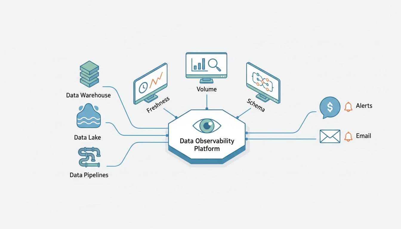
A good tool doesn’t just detect anomalies. It also answers two questions fast: “What broke?” and “Who cares?” If you can’t map an incident to impacted assets (and owners), alerts become background noise.
If you want extra context on how the category is being framed this year, Monte Carlo’s take on the 2026 Gartner market guide discussion is a useful reference point.
Monte Carlo vs Bigeye vs Soda: the real tradeoffs for small teams
All three can improve data quality, but they tend to win in different operating styles.
Monte Carlo is typically chosen when you want broad coverage quickly with less rule-writing. Its positioning centers on end-to-end observability and faster triage, and it continues to expand into adjacent areas like agent and AI visibility (see Monte Carlo’s post on Agent Monitors for how they describe that direction). For many teams, the value is the speed from “connected” to “useful incidents.”
Bigeye often appeals when you want automation plus strong customization. It’s commonly described as ML-driven anomaly detection with room for explicit rules, plus lineage and business-friendly views. Bigeye also publishes its own perspective in this Monte Carlo vs Bigeye feature comparison, which can help you build a shortlist of questions for demos.
Soda tends to fit teams that like “quality as code.” If you already live in Git and CI, Soda’s workflow can feel natural because checks are declarative and versioned. Soda is also pushing into AI-assisted workflows (for background, read Announcing Soda AI) and data product style reporting via APIs (see the Soda Reporting API announcement).
Here’s a practical, non-marketing way to compare them:
| Dimension | Monte Carlo | Bigeye | Soda |
|---|---|---|---|
| Best “first win” | Fast anomaly coverage across many assets | Balanced anomaly detection plus tailored rules | High-signal checks you define and ship in CI |
| How you build monitors | More automated defaults, fewer hand-written rules | Mix of ML + custom metrics and rules | Mostly code-defined checks (YAML/SQL patterns) |
| Triage experience | Often strongest when you need impact and root cause quickly | Strong UI and lineage views, can require tuning | Great when your team already owns tests and deployments |
| Team fit | Small teams that need speed and breadth | Teams that want control without losing automation | Builders who prefer tests-as-code and reviews |
| Stack constraints | Often best in modern cloud stacks | Often positioned for hybrid and migration scenarios | Flexible, but you own more of the “how” |
Pricing changes, so don’t anchor on old blog posts. Instead, verify current levers during a pilot: number of assets monitored, monitor frequency, compute costs, lineage depth, environments (prod plus staging), and alert destinations. If a plan caps monitors or incidents, ask what happens when you grow.
A quick gut check: if your team avoids writing checks because it feels endless, start with automation-first. If your team dislikes “black box” alerts, start with code-defined checks.
For broader market scanning, this roundup from Integrate.io on top data observability tools for 2026 can help you sanity-check your shortlist.
An automation-ready evaluation kit (scorecard, pilot, baseline, runbook)
You don’t need a 3-month bake-off. A tight pilot can answer 80% of the decision.
Fill-in-the-blank evaluation scorecard (copy/paste)
Use one row per tool and score 1 to 5. Add notes you can defend.
| Category | Weight (1-3) | Score (1-5) | Notes (what you verified) |
|---|---|---|---|
| Time to first useful incident | ___ | ___ | ___ |
| Monitor coverage for key assets | ___ | ___ | ___ |
| Alert policy controls (routing, dedupe) | ___ | ___ | ___ |
| Incident workflow (assign, ack, resolve) | ___ | ___ | ___ |
| Root cause and impact mapping | ___ | ___ | ___ |
| Custom monitor support (SQL, rules) | ___ | ___ | ___ |
| SLO reporting for critical assets | ___ | ___ | ___ |
| Cost predictability (your expected growth) | ___ | ___ | ___ |
| Ease of ownership setup (teams, on-call) | ___ | ___ | ___ |
| Security and access controls | ___ | ___ | ___ |
10-day pilot test plan with pass/fail criteria
Pick 10 to 20 critical assets (one dashboard, one dbt model chain, one marketing attribution table, one customer table). Then run these tests:
- Known incident replay (or synthetic failure): Pass if the tool detects it and creates an incident within ___ minutes.
- Alert latency: Pass if alert delivery to Slack/email happens within ___ minutes of detection.
- False positive rate: Pass if fewer than ___% of incidents are noise over 10 days.
- Ownership routing: Pass if the right owner gets assigned for at least ___% of incidents.
- Impact accuracy: Pass if impacted downstream assets are correctly listed for ___ of ___ seeded issues.
- Monitor edit speed: Pass if a new monitor can be added and deployed in under ___ minutes.
- SLO tracking: Pass if you can define an SLO for freshness and see breach history clearly.
- Dedupe and grouping: Pass if one upstream break doesn’t create ___ separate incidents.
- Auditability: Pass if each incident shows evidence (query samples, metric trend, run history).
- Cost guardrails: Pass if you can cap scope (assets, frequency) without losing critical coverage.
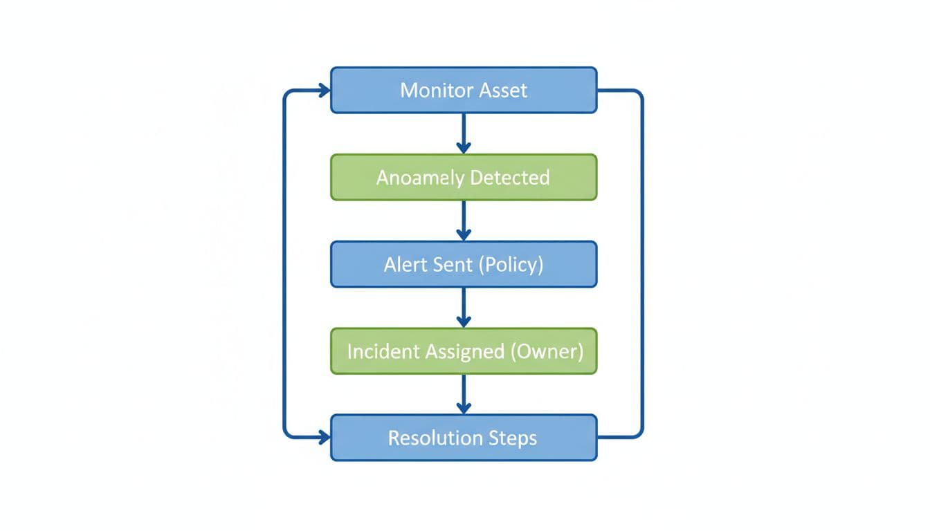
This is the incident flow you want the tool to support end to end:
Minimal monitoring baseline (top 10 checks)
Start with boring checks that catch expensive mistakes:
- Freshness per critical asset (late data)
- Volume anomalies (spikes, drops)
- Schema changes (added, removed, type changes)
- Null rate for key identifiers
- Uniqueness for primary keys
- Duplicate rate for event IDs
- Distribution drift for core dimensions (country, channel)
- Referential integrity between facts and dims
- Row count reconciliation after key transforms
- Business metric sanity (signups, spend, revenue) within expected bands
Runbook outline (one page)
- Incident title: Asset, monitor, severity, timestamp
- Customer impact: Which reports or automations are wrong
- Owner: Person and backup
- Immediate actions: Stop downstream jobs, freeze dashboards, notify stakeholders
- Diagnosis steps: Check upstream run history, recent schema changes, source delays
- Fix steps: Roll back transform, patch source mapping, re-run backfill
- Validation: Recompute metrics, verify monitor recovery, confirm SLO status
- Post-incident: Add or tune monitor, update alert policy, document root cause
Conclusion
Monte Carlo, Bigeye, and Soda can all raise your data quality bar in 2026, but they reward different habits. Pick the tool that matches how your team builds, ships, and responds to incidents. Run a short pilot, score it honestly, and keep your first scope small. After that, data observability tools stop feeling like overhead and start feeling like sleep insurance.